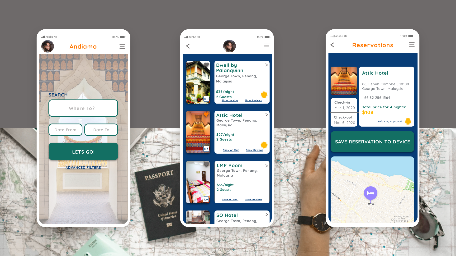
Andiamo: a location-based responsive web app
Role: UX/UI Designer Project Duration: 2 months (15 hours/ week) Stakeholder: CareerFoundry Tools: Adobe XD, UsabilityHub, Prott, Unsplash
Proposal
A travel app for those who want to see the world! Travel can be intimidating and one of the biggest reasons is the risk involved: is it safe to go where I want to travel? This app will also include a guide for appropriate dress and a social “meet-up” page for members to find fellow travelers, share stories, and ask advice; similar to Lonely Planet’s Thorn Tree Forum.
Goal
To create a responsive web app with offline features. It will have all the bells and whistles as its competitors (such as AirBnB and Booking.com), but with extra features such as “Safe Stay Certification”, which indicates if an accommodation has been verified by other travelers as a good place to stay.
UX/UI Project outline
UX (User Experience):
Competitive Analysis
User Research & Personas
User Flows
Exploratory Sketching & User Testing
UI (User Interface):
Mood Boards
Mid-fi Wireframes
Style Guide
Final Screens
Mockups
Competitors Analysis
Airbnb
Behind every stay is a real person who can give you the details you need to check in and feel at home. Airbnb Experiences are not your typical tour. Whether you’re on a trip, exploring your own city, or staying at home, learn something new from an expert host.
SWOT Analysis:
Strengths:
One of the top 5 most popular travel apps
Offers unique accommodations compared to a traditional hotel.
Weaknesses:
Potentially overwhelming for new users
Opportunities:
Expand advertising beyond social media
Threats:
New competitors such as HomeStay and Booking.com
Booking.com
Founded in 1996, Booking.com has grown from a small Dutch start-up to one of the world’s leading digital travel companies. They seamlessly connect millions of travelers to memorable experiences, a variety of transportation options, and incredible places to stay – from homes to hotels, and much more. As one of the world’s largest travel marketplaces for both established brands and entrepreneurs of all sizes, Booking.com enables properties around the world to reach a global audience and grow their businesses.
SWOT Analysis:
Strengths:
They offer a variety of travel services
Customer loyalty drives most of their traffic
Weaknesses:
It’s easy to find accommodations on Booking.com, but their other services aren’t as user friendly.
Opportunities:
Room for UI improvement
Tailored trips to specific clients
Threats:
Strong competitor sites such as Expedia and Hotels.com
User personas
Who? I am designing a travel app with the female customer in mind.
What? Users will be able to book accommodations, research location guides, read other users posts for recommendations and find useful travel tips.
When? My audience will be engaging in this app whenever they are inspired to go on a trip, or when they need to book accommodations.
Where? Users will use this before, during and after their trip.
Why? My audience will understand the nuances of what it’s like to travel as a female, and will be encouraged to find a community of like-minded travelers.
How? Users will find accommodations and features easy to navigate. Information won’t be overwhelming, but simple and to the point.
user flows
After conducting a competitors analysis, interviewing potential users and creating user personas, I began exploring user flows. After interviewing my potential users, I had a better understanding of their needs as travelers using a location-based app. Here are the user stories I came up with followed by my final user flow:
User Story 1: When I sign up for the app, I want to create my profile so I can manage my bookings, browse new accommodations, and check out my saved list(s).
User Story 2: When I plan a trip, I want to be able to search for accommodations with certain requirements so I can narrow down my choices.
User Story 3: When I am researching my trip, I want to read reviews and recommendations from other travelers so I can make sure the place I’m staying is right for me.
EXPLORATORY sketching and User Testing method
Using the “Crazy 8’s method”, I started designing my lo-fi screens. I then uploaded a mock prototype to Prottapp.com for users to test before moving onto the next step.
mid-fi wireframes
mood boards
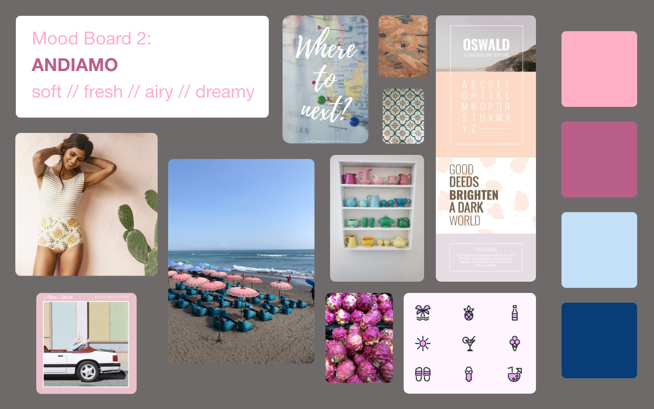
After analyzing my user personas and MVP document, I decided Mood Board 1 is the design direction I am moving forward with. The colors are more gender neutral, making it more accessible to everyone. Although my app has the female identifying customer in mind, this design direction will inspire every user to get out there and explore. Although I really like Mood Board 2 as well, I felt the color palette and imagery might be too gender specific therefore leading me to choose Mood Board 1 as my design direction.


Inspired by adventure with the DIY traveler in mind. Color palette and font choices are bolder. Images are of street food, busy markets, and the general pulse of a bustling city abroad!